arrow_back Back home
29 August 2024Soil analysis in your browser
Try the redesigned web app here.
Adding soil spectroscopy tools
This summer I had the privilege of interning in the USDA’s AI Center of Excellence/SCINet. I studied how light can be used to predict chemical and physical properties in soil. With a handheld spectroradiometer (that looks a lot like a flashlight), farmers can shine a light on their field and get a rich report in milliseconds. That’s a major improvement over how soil tests usually work: soil in box, box in mail, wait weeks, pay lots of money. See my research poster here and my modeling code here.
As an extension, I wanted to bring this lab work straight into the hands of farmers, for free on their phones and tablets. That led me to a complete redesign of Druid, my online plant and soil analysis tool. First, Druid now interacts with you in a familiar, straightforward chat format. But in addition to its preexisting plant AI model, it now has a second soil spectroscopy model.
The model is a 1D CNN that I developed this summer. This model significantly outperformed a Cubist regression model, which is the current standard in soil spectroscopy.
The ability to predict physical properties with spectroscopy is unusual. These predictions will likely never be as good as the results from precise, expensive lab tests, but they are certainly good enough to give farmers and agronomists a quick measurement.
The training data and percentile measurements come from the OSSL dataset.
UI update
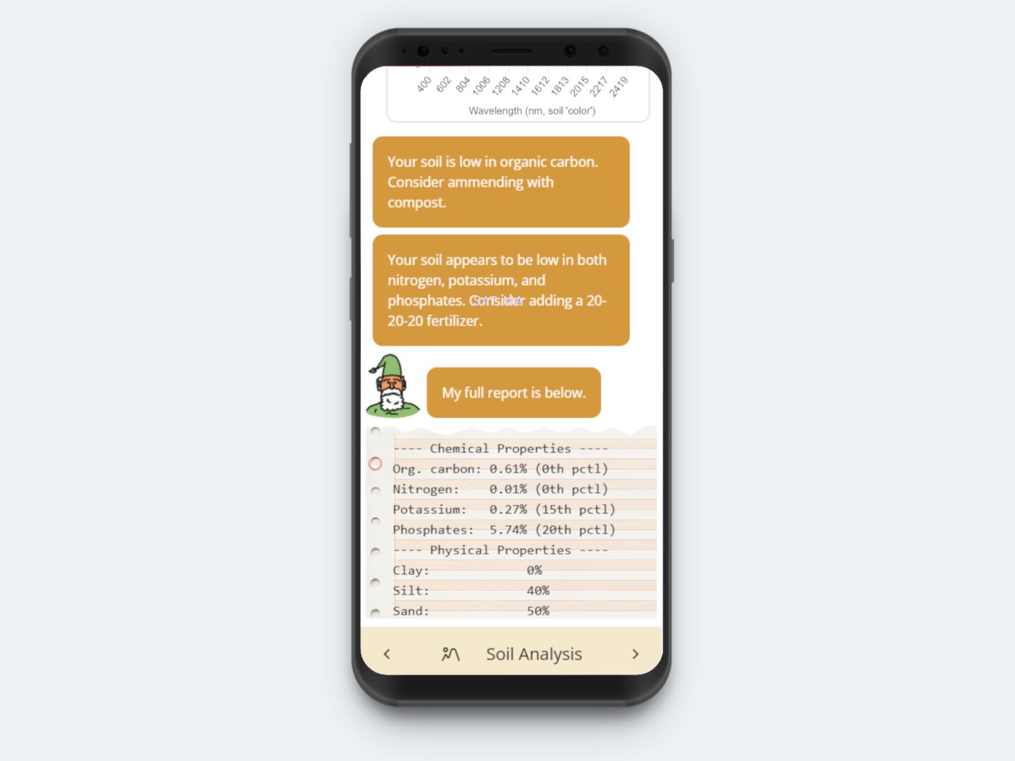
Above: Druid’s soil analysis UI.
In addition to its new technical abilities, I wanted Druid’s interface to be extremely simple and approachable. I purposely made the Druid character look cartoonish, not polished. I strongly believe that if an AI system is limited, it should show. Many AI tools are either portrayed as colorful, vague blobs or as uncanny creepazoids. A quick search on a design website yielded these:
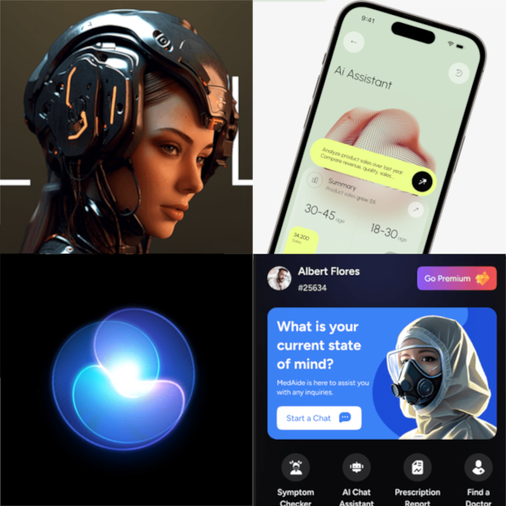
Above: Top results for “AI Assistant” on a major design website. Do these look friendly?
I thought instead of a shaggy wizard from the forest, a druid (literally “oak-knower”). Here are some sketches:
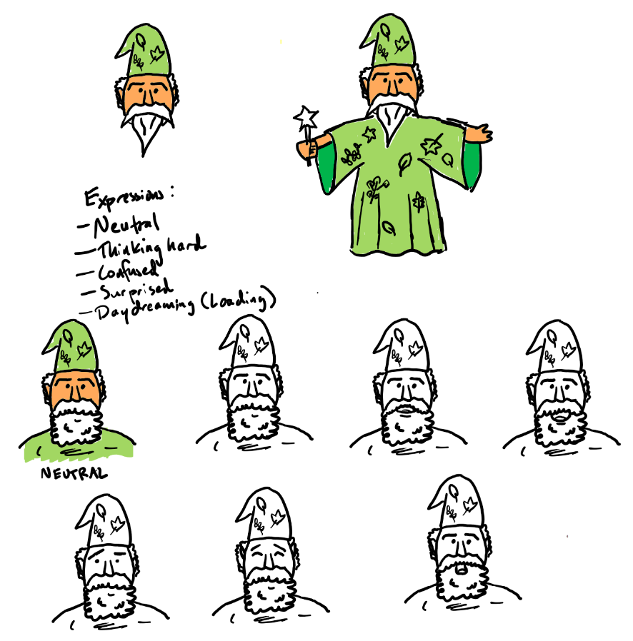
Above: Concepts for Druid’s (re)design.
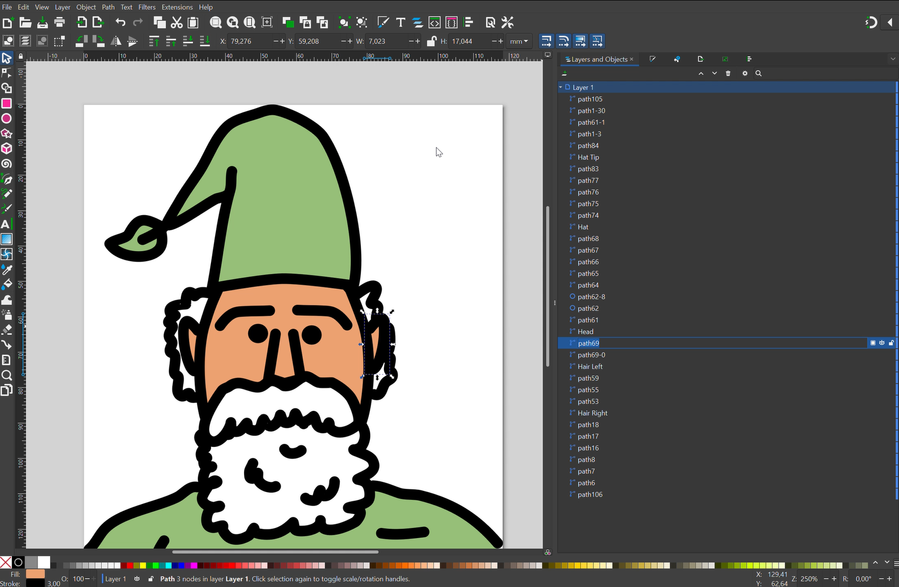 Above: Cleaning up and vectorizing the concept, then animating it with Lottie and Synfig.
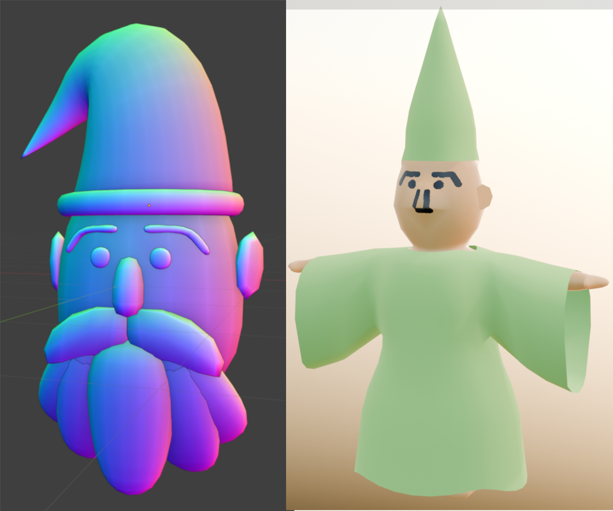
Above: Attempts in 3D with Blender.
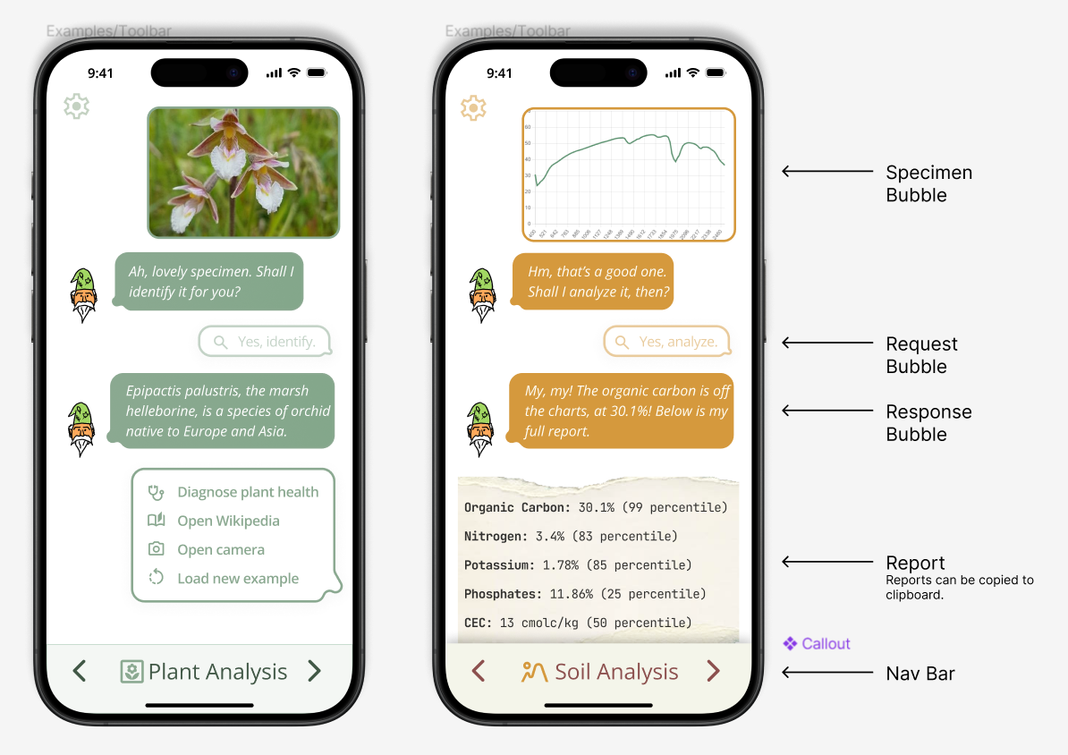
Above: The original Figma mockup.
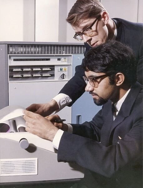
Above: Programmers examining the printout from an old mainframe. This was the inspiration for Druid’s skeumorphic, shareable soil report “printouts.”